UX Research · Product Strategy · Mobile Prototype
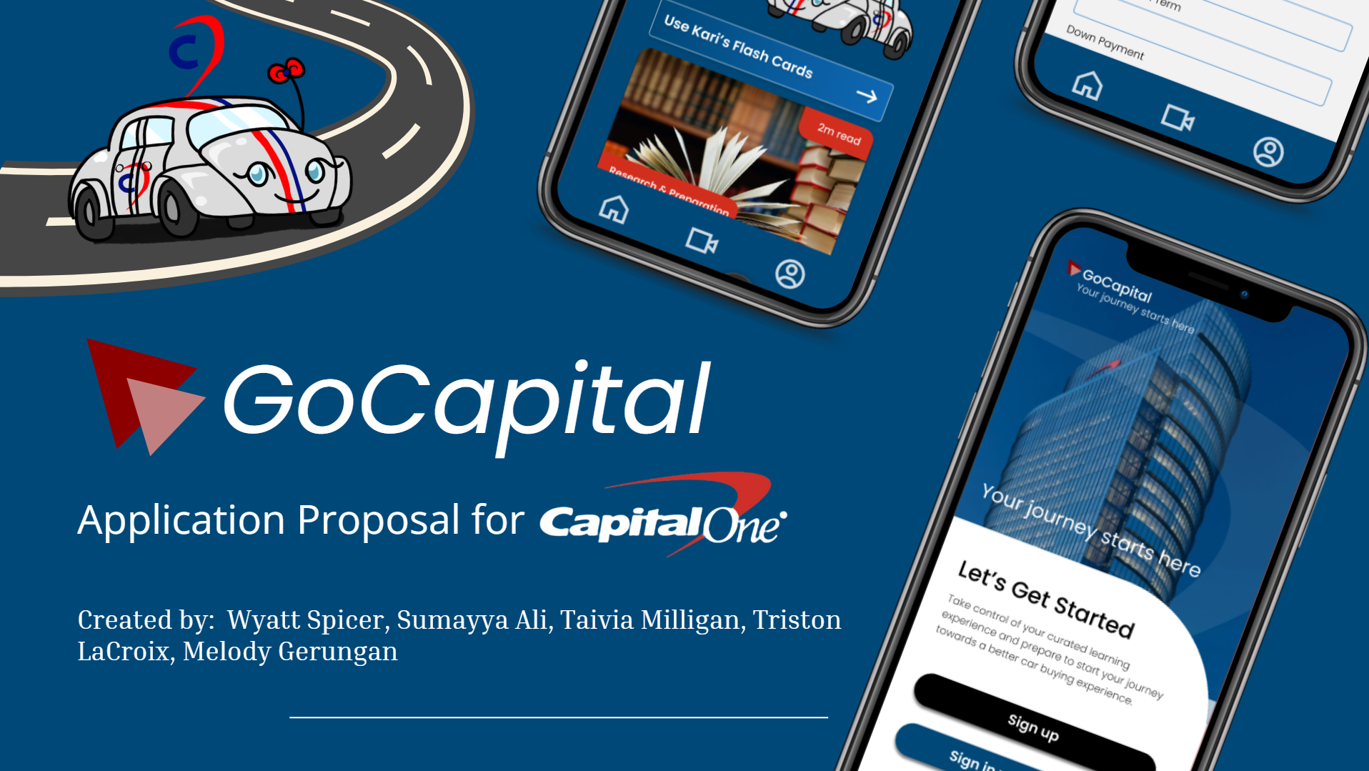
GoCapital
Auto Quest
A mobile-first product concept that turns first-time car buying from a high-pressure financial maze into a guided, learnable, confidence-building journey.
Overview
A finance app for the moment before a first major purchase gets scary.
GoCapital Auto Quest is a UX case study for college-aged and young adult users preparing to buy a car for the first time. The project was framed around a very specific moment: the user knows they need transportation, has some idea of a monthly budget, but does not yet understand how credit, lender financing, dealer financing, down payments, insurance, taxes, and long-term ownership costs all fit together.
The product concept responds to that anxiety with guided education, personalized onboarding, calculators, saved vehicle review, plain-language finance explainers, and dealership preparation tools. Instead of assuming users already know how the system works, the experience teaches the system as the user moves through it.
First-time buyers were not missing motivation. They were missing a map.
Core design insightThe goal was not to make car buying feel artificially fun. The goal was to make it feel less opaque. The app acts like a calm, structured guide between the user and one of the first major financial decisions of adulthood.
Brief
The assignment was bigger than a polished mobile mockup.
The project asked for a product experience that could support people entering the car-buying process with limited knowledge. That meant the solution had to do more than display cars. It needed to explain money, sequence decisions, reduce intimidation, and help users recognize when they were ready to talk to a lender, dealership, parent, or advisor.
A young buyer is excited about independence but unsure how loans, interest, credit, insurance, taxes, and dealer conversations actually work.
GoCapital organizes the process into a guided path: learn the basics, calculate affordability, review options, save decisions, and prepare before talking to a dealer.
Team and role
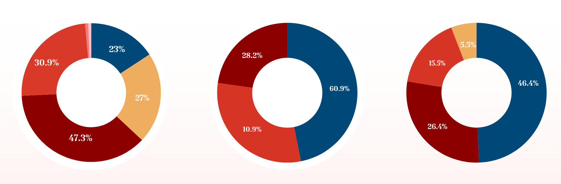
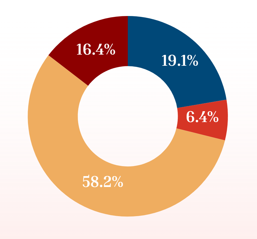
Research
The research pointed to a confidence gap, not just an information gap.
The strongest research signals were not just that users lacked information. The bigger issue was that they did not know which information mattered when. A user can look up the definition of APR, but that does not automatically tell them how APR changes the monthly payment, why a credit score affects approval, or whether a dealership offer is better than lender financing.

Research interpretation
Product Strategy
From anxiety to a guided decision path.
The product strategy was to turn car buying into a journey users could move through one step at a time. Every feature had to answer one of three questions: What should I learn? What can I afford? What should I do next?
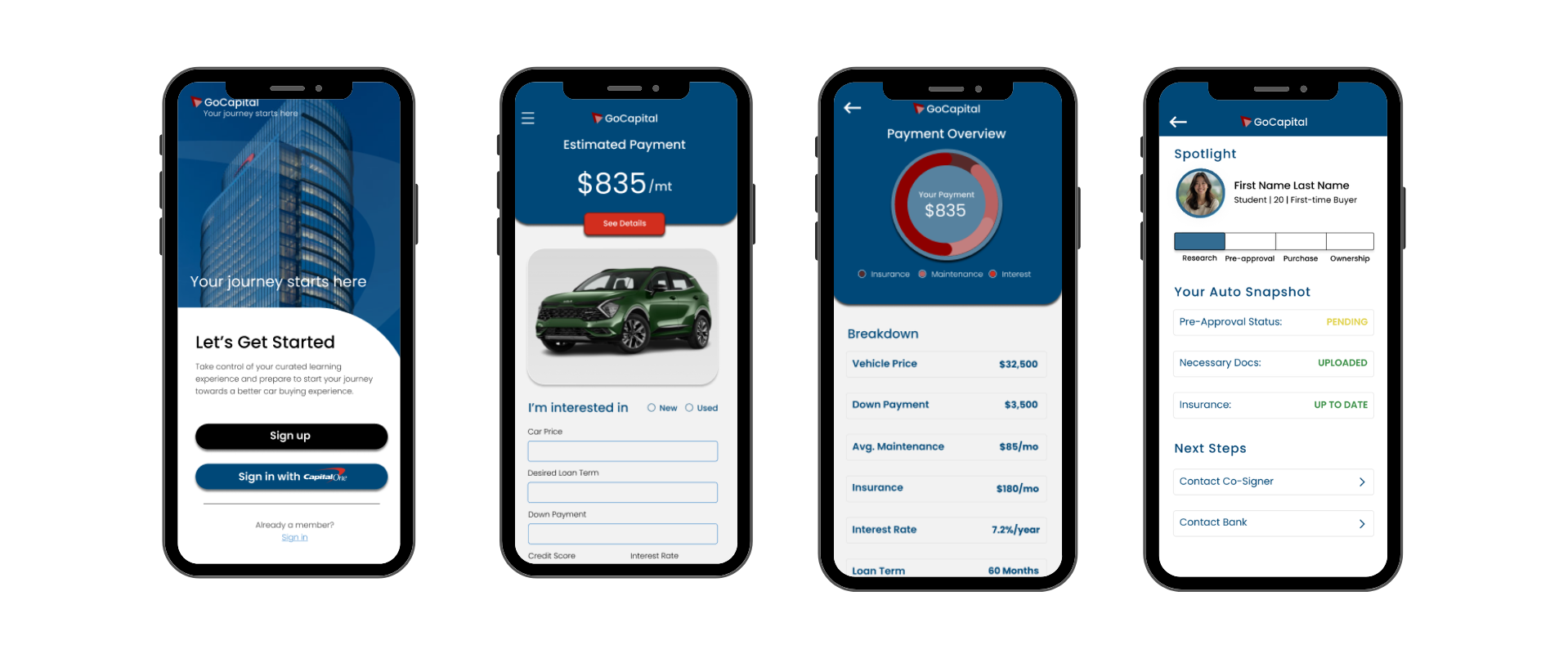
1. Personalized onboarding
Users enter their buying timeline, budget range, experience level, and comfort with financing so the app can adjust the path instead of treating every buyer as the same person.
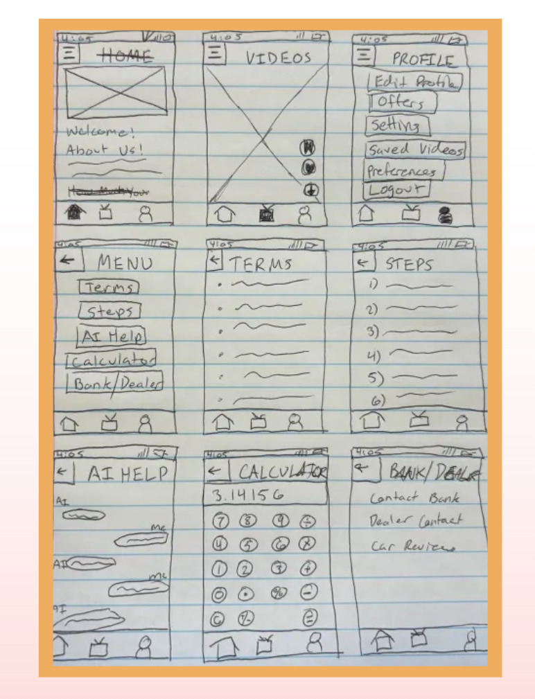
2. Step-by-step auto quest
The central journey breaks the process into manageable sections: credit, budgeting, loan basics, dealership prep, insurance, ownership costs, and final review.
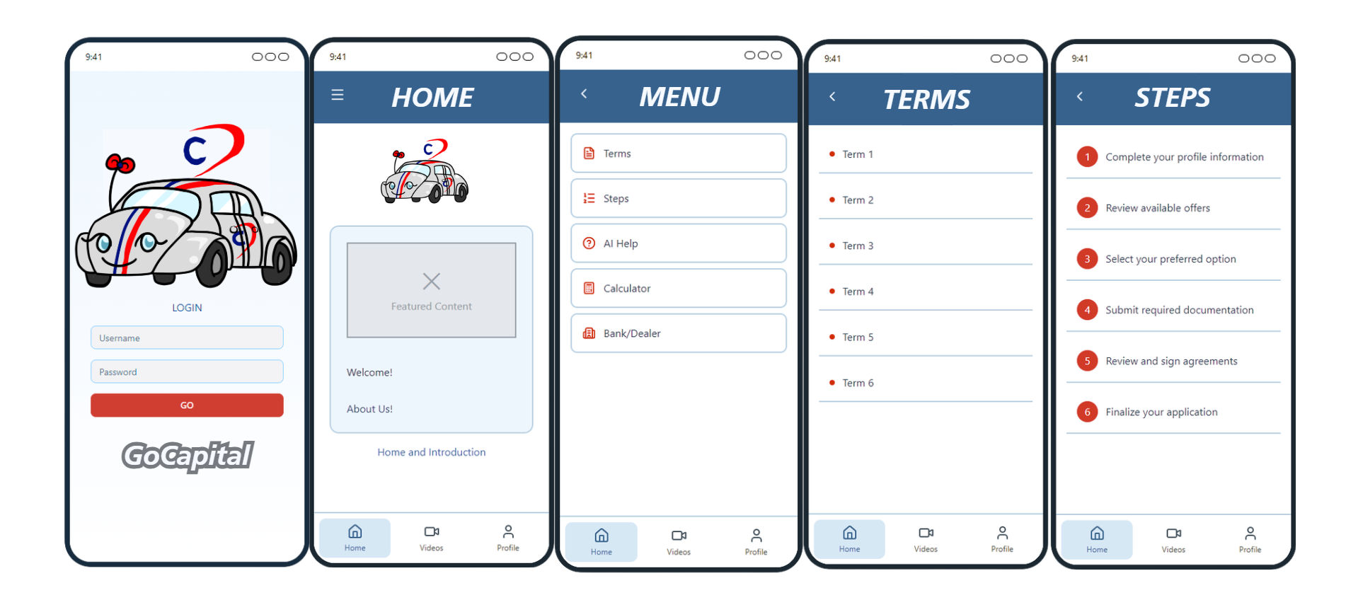
3. Plain-language glossary
Finance and dealership terms are explained before the user needs them, reducing the vocabulary gap that makes conversations feel intimidating.
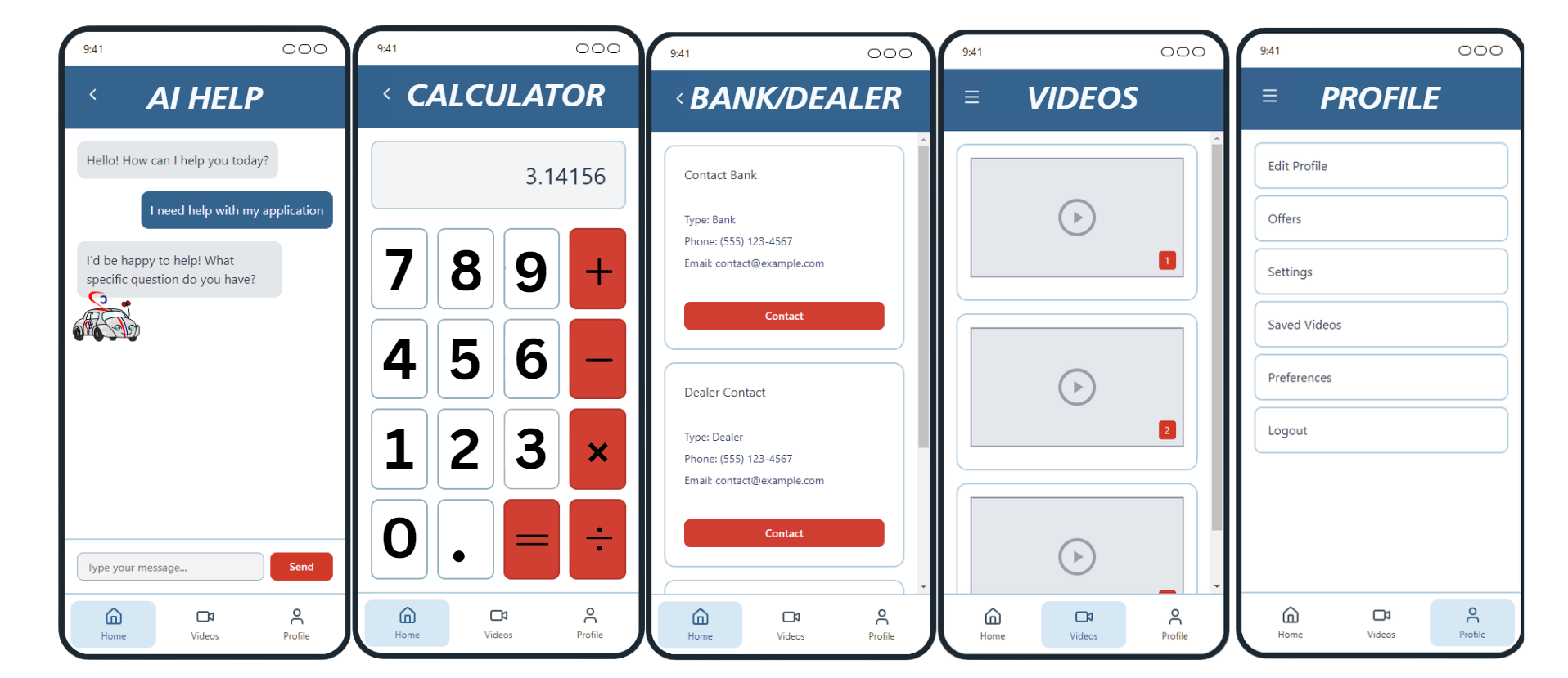
4. Calculator and car review
Users can test payment scenarios, down payments, and affordability before becoming emotionally attached to a specific vehicle.
5. Saved decisions and profile tools
The experience remembers progress, saved cars, and user preferences so the app feels like a preparation workspace rather than a static article.
6. Short-form learning feed
A familiar video-style format lowers the barrier to financial education and makes preparation feel less like homework.
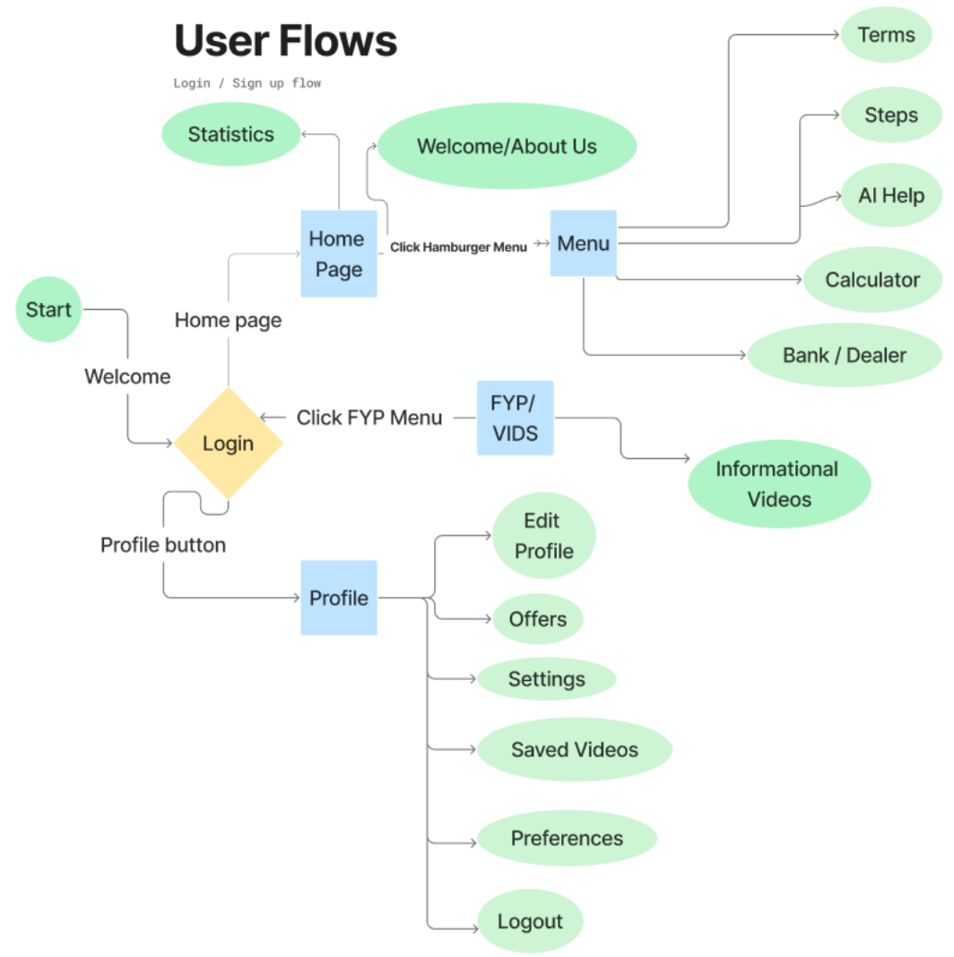
Information Architecture
The app structure had to make the next step obvious.
The user flow organizes the experience around progression, not browsing. A first-time buyer should never have to ask, “Where do I go now?” The dashboard, learning path, calculator tools, glossary, saved cars, and profile settings all connect back to the same core objective: helping the user prepare for an informed buying conversation.
Visual System
Calm financial clarity instead of dealership chaos.
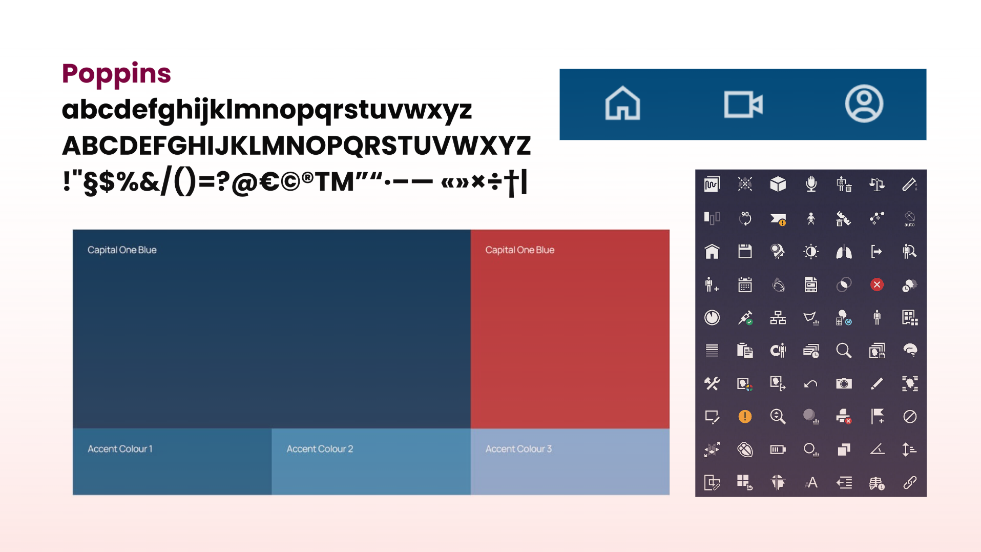
The visual system uses a clean mobile-app language: bright blue for action and trust, soft supporting colors for section distinction, high-contrast type, rounded cards, and icon-driven navigation. The design needed to feel credible enough for finance, but approachable enough for young buyers who may already feel intimidated.
Dense banking dashboards, dealership-style hype, aggressive sales language, and intimidating finance terminology stacked without context.
A guided, modular interface where each card has a clear job: teach, calculate, save, compare, or prepare.

Prototype
The final screens turn research into usable motion.
The prototype demonstrates how users move from onboarding into a dashboard, guided learning, video education, calculator tools, saved items, and profile support. The final app experience gives users a sense of forward movement: they are not just reading about buying a car; they are completing a preparation process.
Interactive prototype
The embedded Figma prototype preserves the interaction model and lets viewers move through the app in the same sequence a first-time buyer would use.
Evaluation
What makes the case study stronger than a screen gallery.
The strongest part of the project is the connection between research findings and feature decisions. The app does not simply say, “car buying is confusing,” then show polished screens. It names the specific confusion: credit knowledge, lender/dealer financing, ownership costs, and reliance on informal support networks. The feature set follows from those findings.
Takeaways
A case study about giving users leverage before a conversation starts.
GoCapital Auto Quest is strongest when understood as preparation software. The user is not buying the car inside the app. The app gives them the vocabulary, calculations, questions, and confidence they need before they enter a dealership or financing conversation.
That makes the design problem more interesting than a simple car marketplace. The real product value is psychological and educational: helping someone feel less alone, less pressured, and less likely to be surprised by the cost of a decision they cannot easily undo.
The question this project answers.
How do you design a mobile experience that turns a confusing, high-pressure financial milestone into a sequence of small, understandable decisions?