Lead Designer
Led the visual direction, mobile app structure, prototype quality, UI system, and case-study presentation.
UX/UI Capstone · UTD
GoCapital Auto Quest was my UTD capstone: a research-led mobile product concept for college-aged and young adult users preparing for their first major vehicle purchase. The story is not “I made an app.” The story is how the team identified a confidence gap around credit, financing, and dealership pressure, then turned that gap into a guided preparation experience.
Project Snapshot
The target user already knows they need transportation. What they may not know is how credit, loan terms, dealer financing, lender financing, insurance, taxes, down payments, and ownership costs fit together. GoCapital was designed around that stressful moment before a first major purchase becomes real.
Led the visual direction, mobile app structure, prototype quality, UI system, and case-study presentation.
College-aged and young adult users balancing budget uncertainty, credit questions, dealer pressure, and outside advice.
The team used quantitative and qualitative research to identify where users felt unsure and what support they expected.
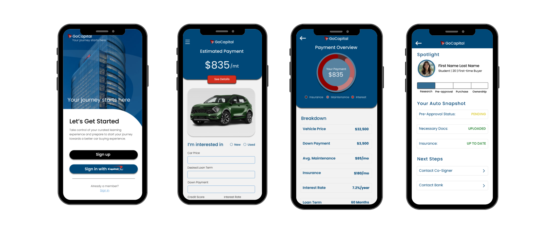
A Figma prototype with onboarding, a guided buying path, glossary support, calculators, saved items, and learning content.
Research Spine
The research showed that users were not simply uninformed. They had fragments: credit score awareness, monthly payment expectations, family advice, and scattered assumptions about dealerships. The design challenge was to organize those fragments into a sequence that could reduce pressure before the dealership conversation starts.
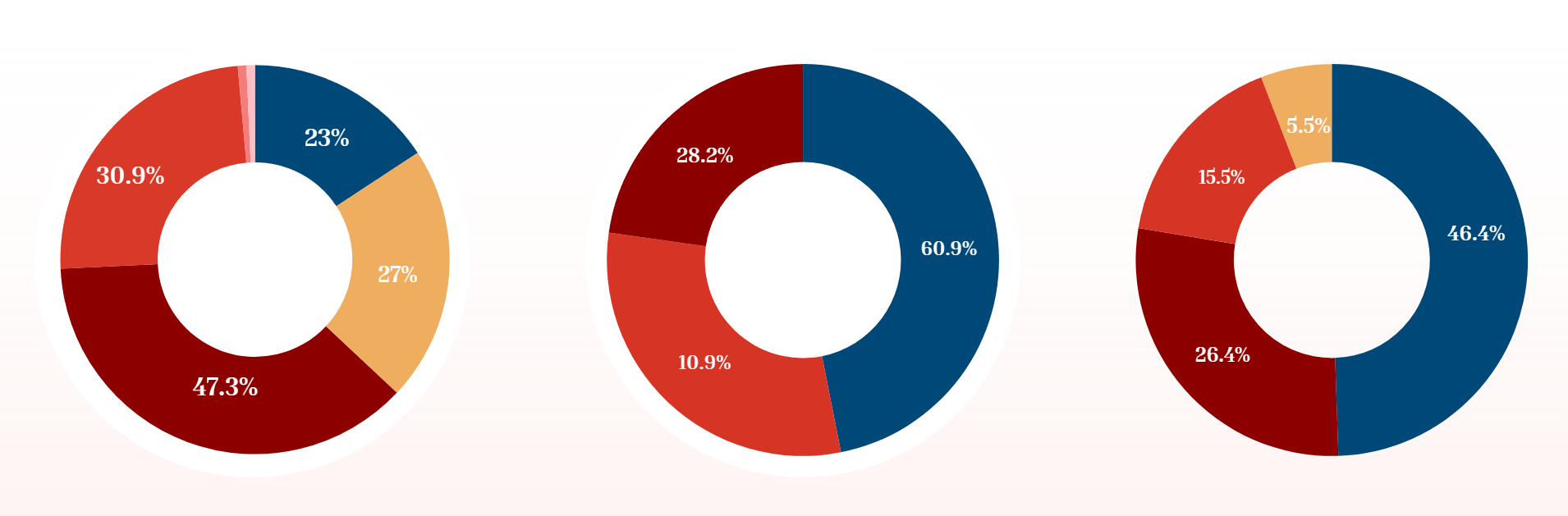
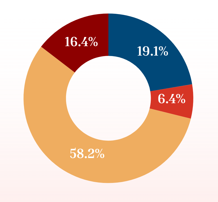
Users needed help before the high-pressure moment. The app could not wait until a buyer was already sitting across from a salesperson to explain the vocabulary, math, or tradeoffs.
The experience needed to pace information, prioritize plain language, and keep the next action obvious: learn the basics, calculate affordability, save decisions, and prepare questions.
Experience Strategy
Every major feature had to answer one of three user questions: What should I learn? What can I afford? What should I do next?
Budget, timeline, experience level, and financing comfort shape the starting path.
Credit, budgeting, loan basics, dealership prep, insurance, ownership costs, and final review become smaller checkpoints.
Important terms appear before users need them, reducing the vocabulary gap that makes buying feel intimidating.
Users can test payment scenarios and affordability before getting emotionally locked into a vehicle.
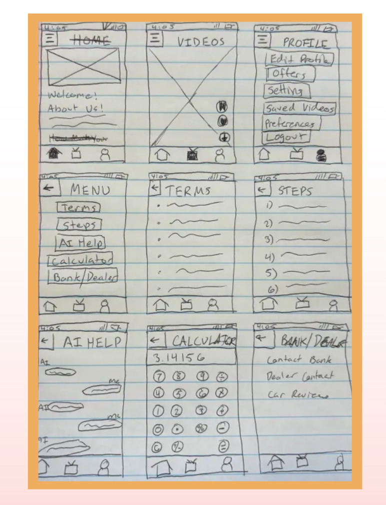
The app works like a preparation workspace, keeping progress, saved cars, preferences, and profile tools together.
A familiar video format lowers the barrier to finance education and makes preparation feel less like homework.
Artifacts
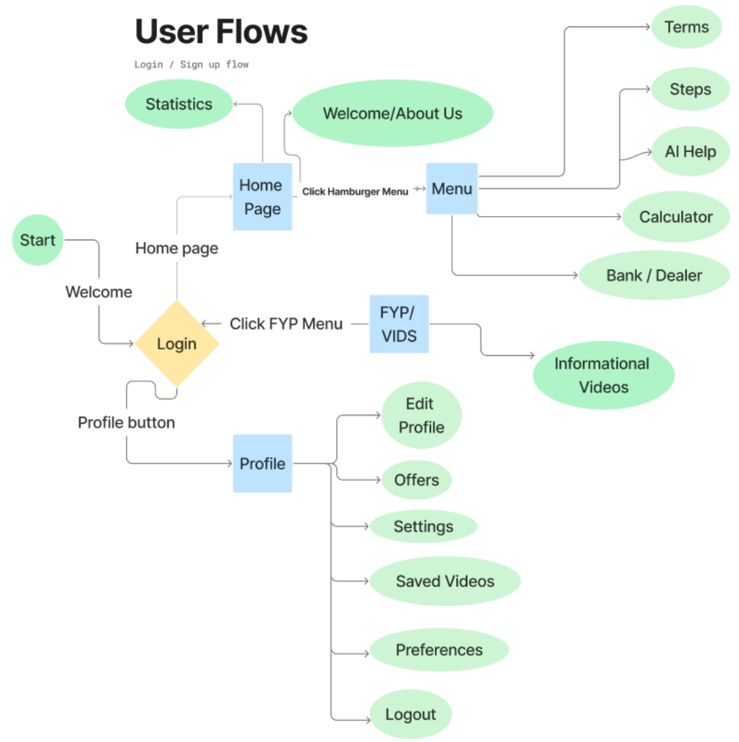
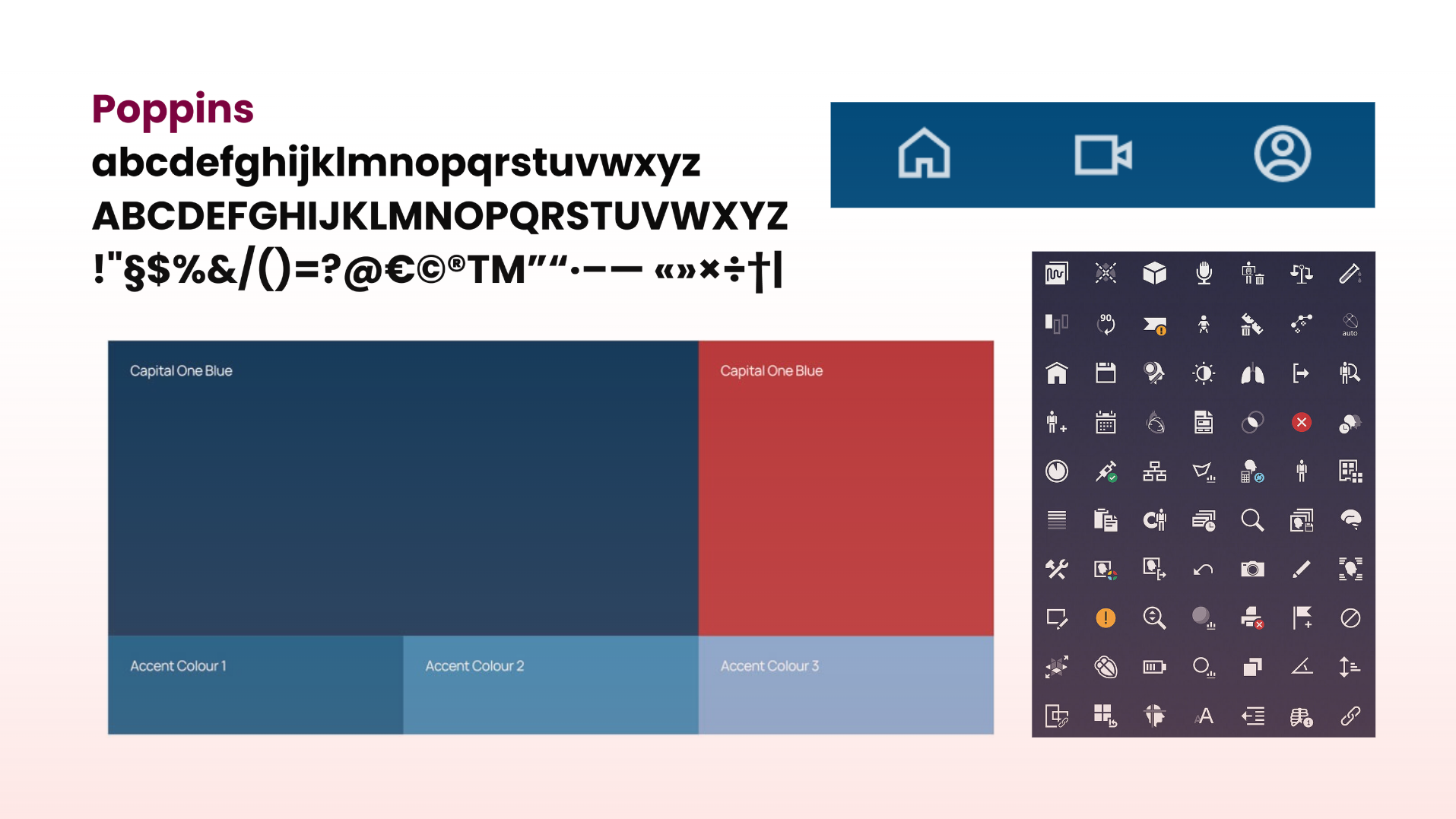
The assets below are the actual project materials already in the portfolio. This page now uses them as evidence of the capstone process instead of treating them like a loose gallery.

Prototype
The embedded Figma prototype and walkthrough videos show how a user moves through onboarding, learning, calculators, saved items, and profile support. The product is not trying to replace a dealership or lender; it helps the user show up prepared.
Reflection
The project worked best when the interface stopped acting like a database of car-buying information and started acting like a path. A first-time buyer does not need every finance term at once. They need the right concept at the right moment, with enough context to make the next decision less scary.
The research-to-feature traceability: financing confusion led to glossary and lender/dealer explainers; affordability anxiety led to calculators; uneven support networks led to a guided preparation flow.
A future pass should run moderated prototype tests around calculator comprehension, glossary usefulness, task success, and whether users feel more confident before a dealership conversation.
Supporting UX Work
GoCapital is the capstone centerpiece. These supporting projects show the same interest in systems, service pain points, community research, and applied product thinking.

An all-in-one restaurant and dine-in theater operations app shaped by first-hand service industry frustration: scattered logins, weak shift communication, disconnected scheduling, and redundant systems.

Research examining campus experiences, safety, belonging, support systems, and barriers to expression for LGBTQIA+ students.
A civic communication concept exploring how law enforcement and communities can communicate more clearly, safely, and accountably.
Open EchoBridge deck